|
|
O N E C R A Z Y M U L T I T A L E N T
|
|
|
|
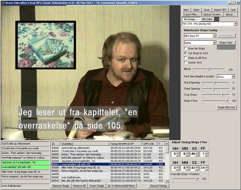
Just some information about the research I did before programming the "Real Classic 80's Videotexter" by looking at old recordings on VHS (from Norwegian channels) and typical rental/buy VHS videos.
I carefully studied the background strip blending, font style, spacing between letters and general typography. I came to the conclusion of 3-4 different main styles which have all been included in the PRESETS for SOCRV.
The screenshots and information provided below can be used as reference when you are editing/compositing subtitles from SOCRV to match closely the look and feel from the classic TV and VHS subtitles from the 80's (or later if you want).
It must be noted strongly that SOCRV *will* not load footage and render subtitles as you seem them in SOCRV's preview window. The actual mixing, blending and compositing the subtitles onto your own footage must be done in your favourite editing software (like for me; Adobe Premiere - any version really).
|
|
|
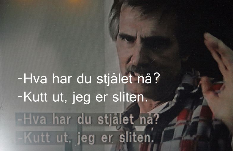
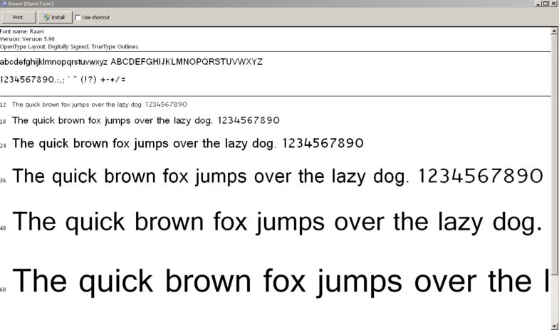
This was my first test with font and layout. The footage was photographed straight from a CRT TV running an old 80's VHS original tape.
The mockup was just done in Photoshop. The font used for first-time comparision was named "Raavi" in regular.
It should be noted that the final font used in SOCRV is:
Swiss 721 Narrow SWA (Swiss721NarrowSWA.ttf)
|
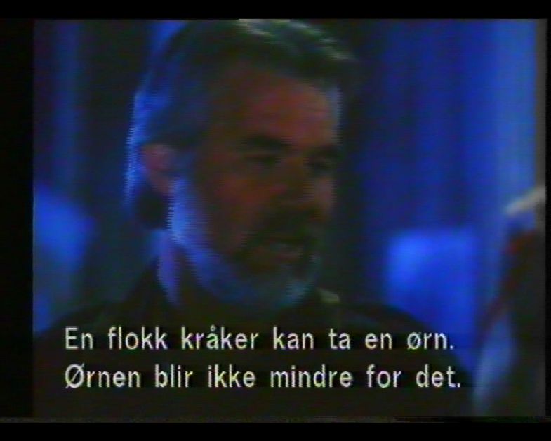
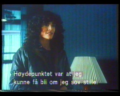
Not sure which movie it came from, but this shows cleary the spacing between strips, its position, the grey background (half blended) along with the font, spacing and what seems to be an offset of shadow.
I cannot be sure if the shadow was intended or is a typical artifact when recorded from a copied VHS or not, but anyway, it looks cool and classic.
I assume the movie was from the mid 80's.
|

|
|
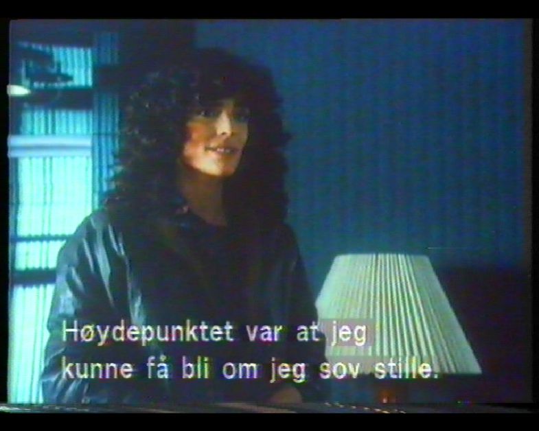
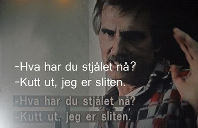
Here the strips are almost invisible, but is probably due to the footage scene is mostly in the dark too. We can notice that the font seems to be a little bit taller than the other typical subtitles presented here. Most likely back in the days, there were 2-3 hardware machines with possible different font-sets that the subtitle operator could choose from, who knows!
I assume that the subtitles (especially the grey background strips) were probably blended/multiplied into the saturation of the footage.
Again, something to think about. To get that same effect with the subtitles generated by SOCRV, you must play around with keying/blending and compositing in your own favourite editing software.
|
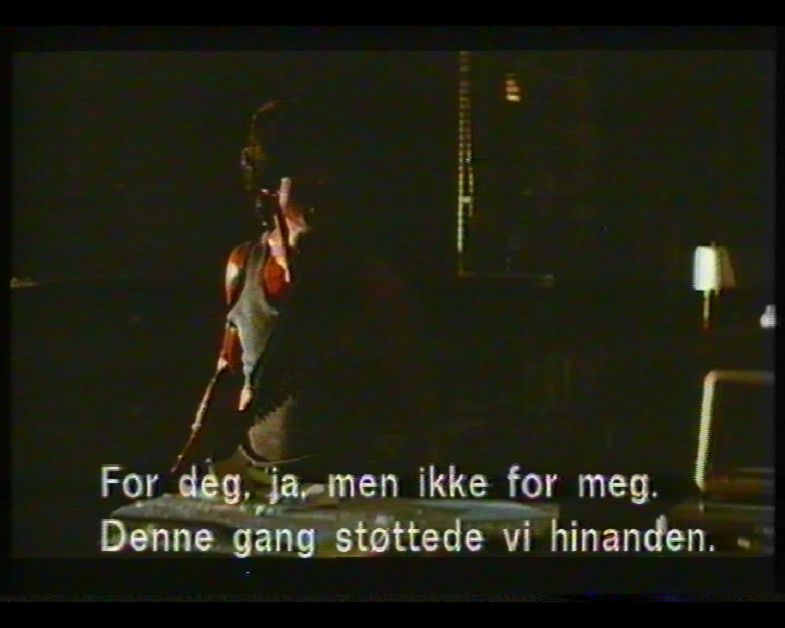
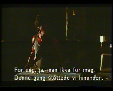
Here is another variation for the gray strips background. Seems to be very faint in some areas, but stronger gray (almost not transparent) when mixed with bright colors in the footage.
Again, adjust the keying for subtitles created by SOCRV to match it in your own editing software.
|
|
|
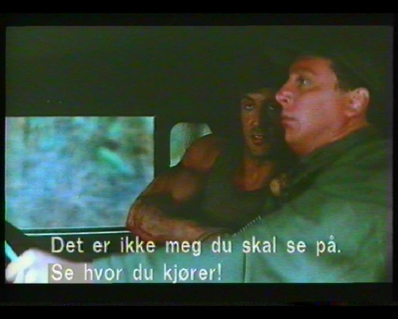
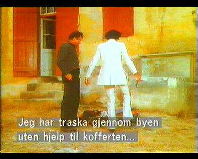
This scene is from Rambo - First Blood that came out in 1982.
Here we can see evidence that gray background strip almost disappear completely when the footage contains dark content.
|
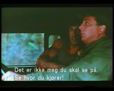
Another scene from Rambo - First Blood from 1982.
Now, again the gray strips disappear in some places, but is seen strongly almost in plain gray on the second line (Se hvor...")
Now, with those 5 images and study above for typical VHS rental subtitling graphics we have enough information on how to mimic this type of blending/keying in our favourite editing software.
Remind you that SOCRV will not perform this keying, but its mostly up to your skills to achieve that type of look as illustrated.
|

|
|
A more recent typical use of subtitles as seen in this captured screenshot from a YouTube video (Derrick, random episode), but with authentic subtitle style from the Norwegian TV-Channel NRK.
The subtitles applied seems to be from 2011.
We can see a different look that the other subtitles above (slightly retuned font). This seems to have a more narrow font spacing but also a darker outline around each letter. Possibly the gray strips background are a bit darker too than on the VHS captures above.
The gray background also seems darker that the usual style from the 80's.
This provided enough information for me to also create a 00's preset in SOCRV.
|
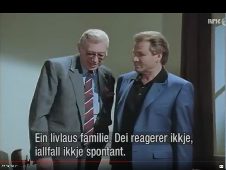
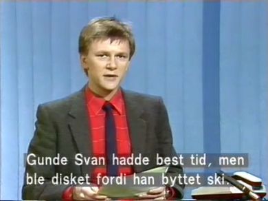
Another recording from real-time news on the same NRK channel.
The look seems almost the same as my video research above, but spacing between letters are more spaced out.
The particular subtitle came from 1986.
So, we can conclude that there were at least two styles of subtitling design depending on VHS or TV-Channels back in the 80's.
This particular subtitle design does not seem to have outlines or the faint shadow that were discovered in the VHS captures above.
Anyway, SOCRV comes already prepared with a couple of presets made by me to match closely the findings above!
|
|

|
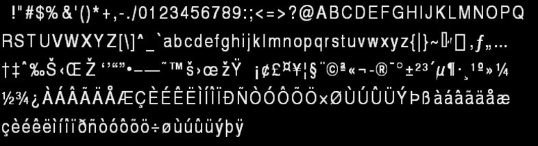
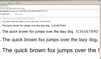
A preview of the actual final font used to render subtitles in SOCRV.
The Raavi font.
|
Here's an example of the pre-rendered font as used in SOCRV, basically just a sprite-sheet.
This isn't done realtime on the users computer, due to the fact that if you had ClearType enabled in your Windows 7+, the fonts and their outlined pixels will be filled with with blue and brown pixels to create the effect of a "better" grey-scaled anti aliasing.
Now, what the hell was Microsoft thinking when they force this on users. Not to mention many popular more modern software (like Firefox, Adobe Illustrator CC and more) seems to FORCE it on us anyway, regardless if you had turned it off on your Windows.
A perfect proof of a failed technology that new-age designers dont seem to get: ITS MEANT FOR OLD LCD-TFT screens produced back in the late 90's for gods sake!!
That to make text appear more smooth on those early-bird TFT that the industry let out to the public.
Nowadays, the TFT technology is far better beyond the 90's and not to mention that 4K resolution is used more, there is no need for ClearType anymore since the pixels are so small, they can be as smooth as thin hair without any need for anti aliasing to "cover it up".
People don't have eyes anymore to instantly detect this failed text rendering technology?
|

|
and finally a preview straight from SOCRV on one of my video productions.
Keep in mind that this preview is just for visualize the placement of strips and see how it would most likely look in the final production. It does not try to create a final look or renders the subtitle graphics onto already created footage.
The final editing and keying of the subtitle graphics are to be performed in your own editing software, like Adobe Premiere where you have much better control of blending, compositing and making your production look like the research examples I have illustrated above.
|
|
|
|